Plotting is a key tool to understand the changes over time in ice core data. There are several different types of plots that you may want to generate, but most are scatter or line plots. Here we show examples of how such plots can be generated using R. The code can be easily modified to work in Python or Matlab.
For each script, unless specificed otherwise, the requirements are:
tidyverse
stringr
matrixStats
dplyr
ggplot2
plotly
zoo
scales
xts
lubridate
tidyr
The scripts generally begin after connection to the database has been terminated and the dataframe to be plotted is called “db”. Units of ppt are parts per trillion.
Basic Plot
#ggplot2 plot
ggp <- ggplot(db %>% drop_na(!!as.symbol("Pb208.LR.ppt")), aes(x = Time.Avg)) +
    geom_line(aes_string(y = "Pb208.LR.ppt"), color = "black", na.rm = TRUE) + labs(x = "Date")

# setting the upperlimit removes really large outliers and allows better visualization of all data
upperlimit <- quantile(db[["Pb208.LR.ppt"]], probs = c(.998),na.rm = TRUE)[1]
#upperlimit <- 50
lowerlimit <- 0

# here we are producing two plots, one which has a ylimit set and one which does not
ggp1 <- ggp+ coord_cartesian(xlim = c(800,2014), ylim = c(lowerlimit, upperlimit))
ggp2 <- ggp+ coord_cartesian(xlim = c(800,2014), ylim = c(NULL))

return(list("TrimmedPlot" = ggp1, "FullPlot" = ggp2))

# save both plots
ggsave(paste(elementname,".Denali.Full.pdf", sep = ""), plot = plots$FullPlot,
    device = "pdf", path = 'ElementPlots/', scale = 1,
    width = 14, height =14, units = "in")

ggsave(paste(elementname,".Denali.Trimmed.pdf", sep = ""), plot = plots$TrimmedPlot,
    device = "pdf", path = 'ElementPlots/', scale = 1,
    width = 40, height =14, units = "in")
#print(plot)
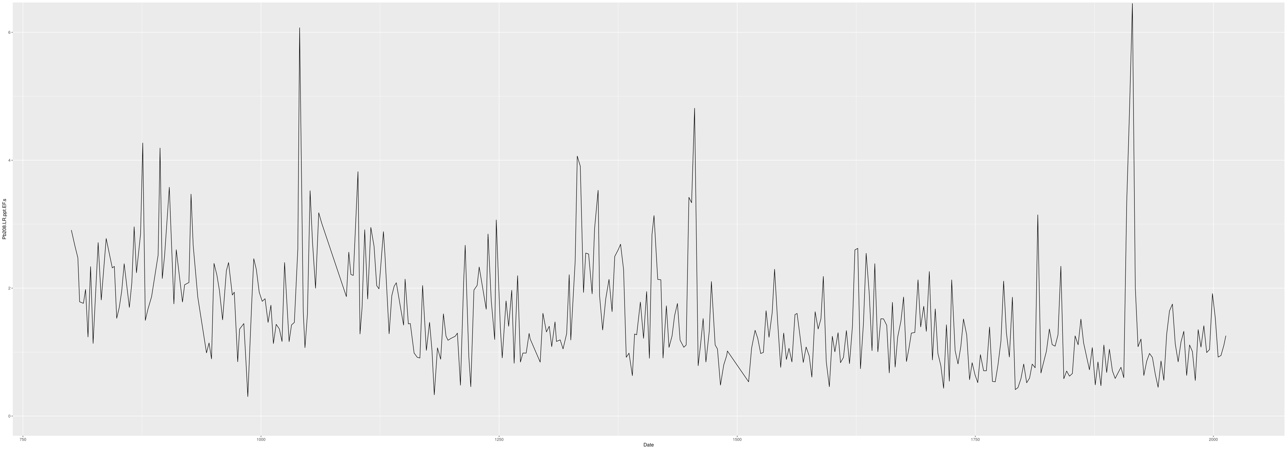
Exported plot of Pb208.LR.ppt with trimmed y limits:
Producing Plots with a Loop
This code allows you to loop through a large number of elements and quickly produce plots for all using ggsave. It is particularly useful for analyses with many elements like ICP-MS data. The plot export will be identical to the basic plot.
TimePlots <- function(elementname){

  #ggplot2 plot
  ggp <- ggplot(db %>% drop_na(!!as.symbol(elementname)), aes(x = Time.Avg)) +
    geom_line(aes_string(y = elementname), color = "black", na.rm = TRUE) + labs(x = "Date")

  # setting the upperlimit removes really large outliers and allows better visualization of all data
  upperlimit <- quantile(db[[elementname]], probs = c(.998),na.rm = TRUE)[1]
  #upperlimit <- 50
  lowerlimit <- 0

  # here we are producing two plots, one which has a ylimit set and one which does not
  ggp1 <- ggp+ coord_cartesian(xlim = c(800,2014), ylim = c(lowerlimit, upperlimit))
  ggp2 <- ggp+ coord_cartesian(xlim = c(800,2014), ylim = c(NULL))

  return(list("TrimmedPlot" = ggp1, "FullPlot" = ggp2))
}

# Here you need to manually set the list of elements (column headers) you want to plot
elementnames = c("Pb208.LR.ppt")

# now we will export the plots as pdf files
for(elementname in elementnames){
  #print(elementname);
  plots <- TimePlots(elementname)
  ggsave(paste(elementname,".Denali.Trimmed.pdf", sep = ""), plot = plots$TrimmedPlot,
         device = "pdf", path = 'ElementPlots/', scale = 1,
         width = 40, height =14, units = "in")
  ggsave(paste(elementname,".Denali.Full.pdf", sep = ""), plot = plots$FullPlot,
         device = "pdf", path = 'ElementPlots/', scale = 1,
         width = 14, height =14, units = "in")
  #print(plot)
}
Plotting Multiple Dataframes on the Same Plot
What if you have more than one dataframe with overlapping data and you want to compare them? First, all the dataframes must be in the same units! Or you need to be prepared to handle multiple units in your plot. Here, is an example where we are bringing Denali Ice Core 2013 (DEN-13A) data from the database. Denali 2019 (DEN-19A) and 2022 (DEN-22A) data is being imported from a local device. Note how units are first converted to be the same across all dataframes and all headers made to match. Then a new dataframe is made, merging all three. From there, plots can be generated.
library(tidyverse)
library(dplyr)
library(ggplot2)
library(ggthemes)
library(scales)
library(plotly)
library(dotenv)
library(RPostgreSQL)
library(dbplyr)
load_dot_env(file = "dev.env")

# Open connection to the database
con <- dbConnect(RPostgres::Postgres(), dbname = Sys.getenv("DATABASE_NAME"), host = Sys.getenv("DATABASE_HOST"),
                 port = Sys.getenv("DATABASE_PORT"), user = Sys.getenv("DATABASE_USER"),
                 password = Sys.getenv("DATABASE_PASS"))

# Import 2013 ice core data
DEN13_icpms_db <- con %>%
  tbl(in_schema("denali", "ICPMS")) %>%
  select(depth_top, depth_bottom, depth_avg, time_top, time_bottom, time_avg, sample_name, isotope_name, isotope_mass, mass_resolution, unit, concentration) %>%
  mutate(element = paste0(isotope_name, isotope_mass, mass_resolution, unit, sep = "_")) %>%
  mutate(across(sample_name, ~str_trim(.))) %>%
  pivot_wider(
    id_cols = c(depth_top, depth_bottom, depth_avg, time_top, time_bottom, time_avg, sample_name),
    names_from = element,
    values_from = concentration) %>%
  collect() %>%
  mutate(core = "DEN-13A") %>%
  mutate(Date_Analyzed = "01-01-2013")

# rename column names to standard format
DEN13_icpms_db <- DEN13_icpms_db %>% rename(
  "K_39_HR_ppt" = "K _39_HR_ppt",
  "V_51_MR_ppt" = "V _51_MR_ppt",
  "S_32_MR_ppt" =  "S _32_MR_ppt")

# Import 2019 ice core data
DEN19_icpms_CSV <- '~/Denali/North_Pacific_Data/Denali/To_add_to_database/Denali_2019_ICPMS_AllData.csv'
DEN19_icpms <- read.csv(DEN19_icpms_CSV, header=TRUE, sep=",", stringsAsFactors = TRUE) %>% data.frame()

# Import 2022 ice core data
DEN22_icpms_CSV <- '~/Denali/North_Pacific_Data/Denali/To_add_to_database/Denali_2022_ICPMS.csv'
DEN22_icpms <- read.csv(DEN22_icpms_CSV, header=TRUE, sep=",", stringsAsFactors = TRUE) %>% data.frame()

# Funtion for unit conversion
UnitConversion <- function (df){
  df %>%
    mutate(across(matches("_ppq"), ~ ./1000)) %>%
    mutate(across(matches("_ppb"), ~ .*1000)) %>%
    rename_with(~ gsub("_ppq", "_ppt", .x, fixed = TRUE)) %>%
    rename_with(~ gsub("_ppb", "_ppt", .x, fixed = TRUE)) %>%
    return()
}

DEN19_icpms <- UnitConversion(DEN19_icpms) %>%
  mutate(core = "DEN-19A")
DEN22_icpms <- UnitConversion(DEN22_icpms) %>%
  mutate(core = "DEN-22") #TODO verify if this is A or B

# Create a new dataframe, which includes all the data -- LONG
Denali_ICPMS <- merge(DEN19_icpms, DEN22_icpms, all = TRUE) %>%
  merge(DEN13_icpms_db, all = TRUE)

Denali_ICPMS_long <- Denali_ICPMS %>%
  pivot_longer(cols = -c(depth_top, depth_bottom, depth_avg, time_top, time_bottom, time_avg, sample_name, core, Date_Analyzed),
                  names_to = "element",
                  values_to = "concentration_ppt",
                  values_drop_na = TRUE) %>%
  mutate(across(c(core, element, Date_Analyzed), as.factor)) %>%
  drop_na(concentration_ppt) %>%
  group_by(core, element, Date_Analyzed)

# PLot mulicore timeseries
plotMultiCore <- function (df, plot_element){
  # Set limits
  upperlimit <-  df %>% filter(between(time_avg, 1980, 2023)) %>% filter(element == plot_element) %>% pull(concentration_ppt) %>% quantile(probs = c(.998), na.rm = TRUE)
  lowerlimit <- 0

  # Multicore timeseries
  timeseries <- ggplot(data = df %>%
    filter(between(time_avg, 1980, 2023)) %>% filter(element == plot_element), aes(x = time_avg, y = concentration_ppt, group = core)) +
      geom_line(aes(col= Date_Analyzed), linewidth = 1) +
    scale_x_continuous(name = "Year (CE)") +
    ggtitle(plot_element) +
    scale_color_colorblind() +
    coord_cartesian(ylim = c(lowerlimit, upperlimit)) +
    theme_tufte()

  timeseries %>% ggsave(filename = paste0('plots/', plot_element, '.jpg'), device = 'jpg', width = 7.5, height = 5, units = 'in', dpi = 300)
  timeseries %>% ggsave(filename = paste0('plots/', plot_element, '.svg'), device = 'svg', width = 7.5, height = 5, units = 'in', dpi = 300)
}

# plot!
for(element in levels(Denali_ICPMS_long$element)){
  plotMultiCore(Denali_ICPMS_long, element)
}
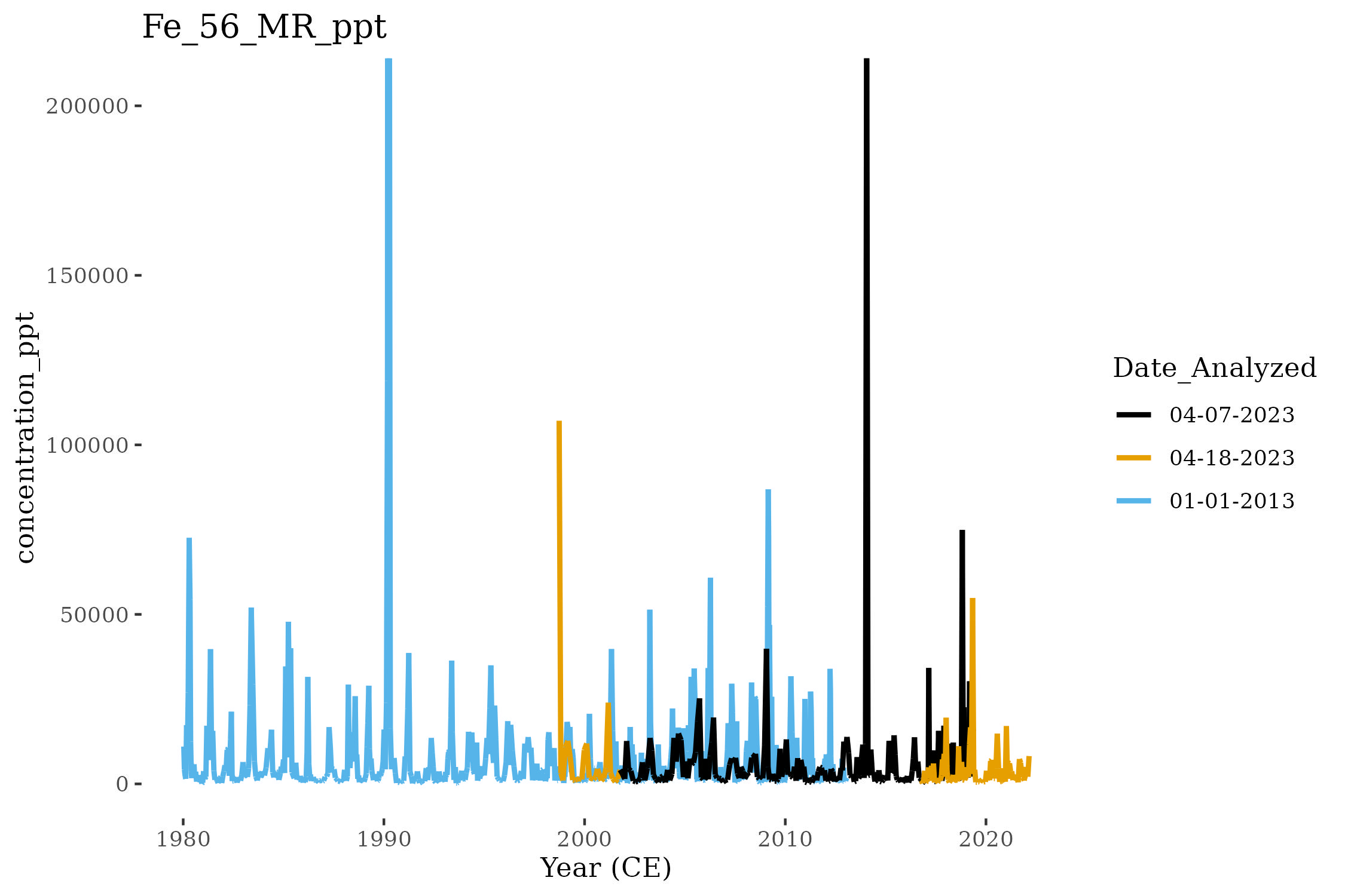
We can compare the composition of iron (Fe) in three Denali Ice Cores (DEN-13A, DEN-19A, and DEN-22A) using this plotting method:
Stacked Graphs
You may want to look at the effect of one data processing technique verses another, this is for you! This quick code stacks plots so that they are easier to compare.
graphingData <- db %>%
drop_na("Time.Avg") %>%
drop_na("Pb208.LR.ppt") %>%
select(c("Time.Avg", "Pb208.LR.ppt", "Pb208.LR.ppt.CrustalEFmed", "Pb208.LR.ppt.EFs", "Pb208.LR.ppt.PbExcess.Med")) %>%
pivot_longer(
cols = c(3:5),
names_to = "Source",
values_to = "ppt"
)
graphingData$Source <- factor(graphingData$Source, levels = c("Pb208.LR.ppt.CrustalEFmed", "Pb208.LR.ppt.EFs", "Pb208.LR.ppt.PbExcess.Med"))
# Natural PB = Pb.S + Pb.Crust
# Pb Excess = Pb - Pb Natural
## Pb = Pb.S + Pb.Crust + Pb.Excess
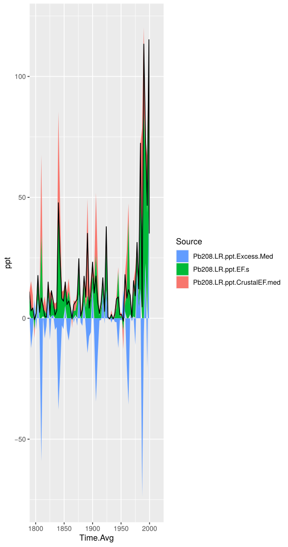
#Stacked Area Graph
ggp <- ggplot(graphingData, aes(x=Time.Avg)) + geom_area(aes(y=ppt, fill=Source)) + geom_line(aes(y=Pb208.LR.ppt))
ggp <- ggp+ coord_cartesian(xlim = c(1980,2000), ylim = c(NULL)) + guides(fill = guide_legend(reverse=TRUE))
ggp
Stacked areas showing the contributions of Pb from volcanic sources (EFs), from the crust (EFc), and excess in the Denali Ice Core DEN-13B. The black line is the concentration of Pb measured by ICP-MS.